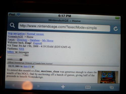
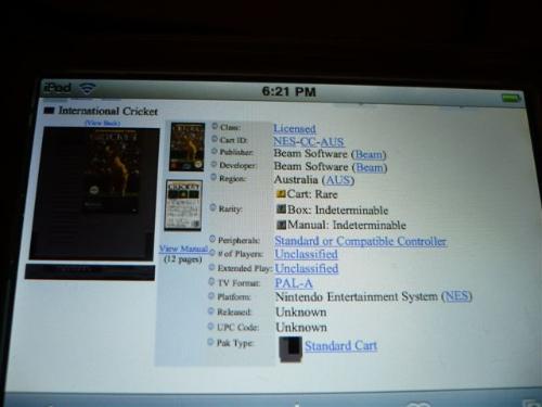
iPod TouchFirmware 1.1.4
No Zoom
Looks great!
I'm guessing this would be the same on an iPhone
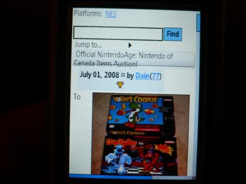
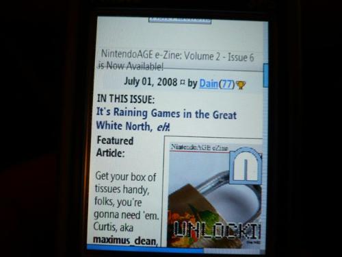
 i-mate SP5
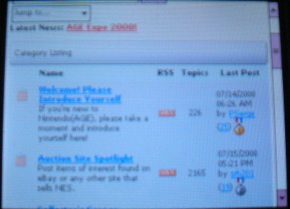
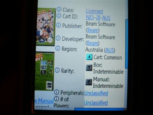
Windows Mobile 5 (Smart Phone Edition)
240x320 resolution
Note this tested the width of the page pretty hard!
Issue: I couldn't log in from the default login page, had to go to a different link to get the login page on the left menu bar. From there I could log in. I guess that this wouldn't be an issue if redirected straight to mobile mode?
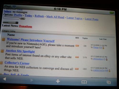
Issue 2: Title boxes on the front screen didn't stretch vertically to accommodate a multi-line title - only aesthetic issue
Main forum list looked ok, again, maybe RSS isn't nesessary here?
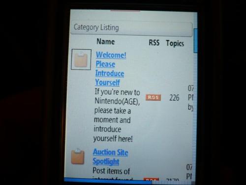
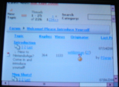
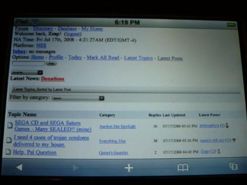
Forum looked ok
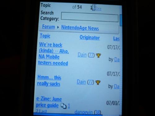
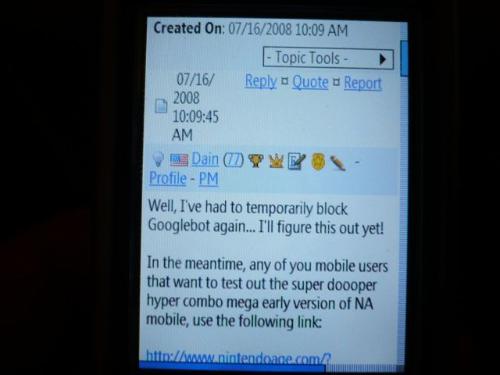
Reading a post - looked good.
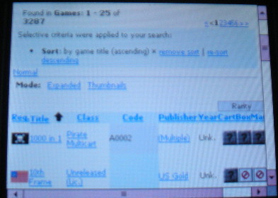
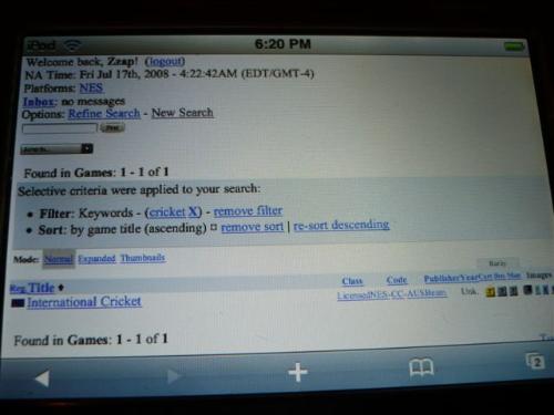
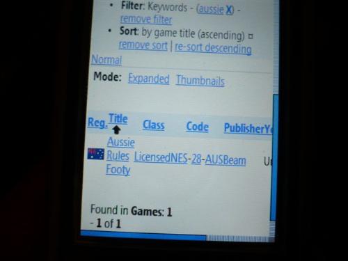
Database search - a little squised, but what can you do?
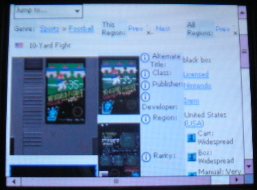
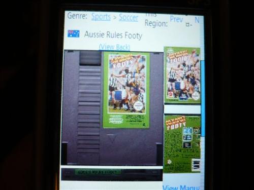
Database entry - looks good
Other comments:
- There is a lot of whitespace in the source code for these pages, is it possible to strip this out before sending them to save mobile users a bit of bandwidth? Anywhere else that pages can be simplified to save bandwidth? (mobile data's pretty expensive here in Aus, and I believe in quite a few other countries too, so cutting down page size would be beneficial)
- Can you default it to a san-serif font family? Even just a simple font family directive for the whole page/site may make it a little nicer to read

Other than that, all seems pretty good
the 240x320 resolution is pretty extreme, and I can't imagine a site looking much better than that on it while still providing as much information.