Introduction
This first lesson briefly covers the essentials of drawing graphics for the NES. Text adventures aside, graphics are the mode through which we enter most game worlds, and are understandably our starting point when discussing their construction. This chapter touches on the core fundamentals of the system, but also lightly raises many other issues that will be discussed in future chapters. It covers a lot of ground for the simple fact that a bit of awareness now can save a tremendous amount of time and headache later.
56 Shades of NES
Perhaps nothing defines the NES, and people’s perceptions and memories of its games, as much as the color palette of the system. The NES PPU (Picture Processing Unit) is capable of displaying sixty four colors, though to be fair slightly less than ten of these are black, hence the number fifty six in our colorfully named title above. The palette is as follows, but it is extremely important to note that the colors will appear differently on different means of display (CRT versus LCD, etc.).

(Taken from somewhere, I forget where exactly)
The numbers that are on the colors are the actual hexadecimal values that are used when inputting them into a program in assembly language. In order to see the visual differences between the colors, it is best to try them out, either on an emulator or actual hardware. Colors can be adjusted in terms of intensity as well, but any changes of this nature will affect all colors that appear on a screen. Fifty six colors, it does not seem like a lot but it would let us create characters and backgrounds on par with early SNES games; however, now the real limitations of the NES need to be described.
Palettes
While the NES is capable of displaying fifty six more or less unique colors, only a small number of these can be simultaneously displayed on the screen at once. There are two
types of palettes that the NES uses on screen at the same time: one for backgrounds and one for sprites. They both partake of the same fifty six colors, but the restrictions for the two types are different. A sample set of palettes that would be used for a screen, using the values given above, is as follows:
Background Palettes:
.db $22,$29,$1A,$0F, $22,$36,$17,$0F, $22,$30,$21,$0F, $22,$27,$17,$0F
Sprite Palettes:
.db $22,$1C,$15,$14, $22,$02,$38,$3C, $22,$1C,$15,$14, $22,$02,$38,$3C
For clarity’s sake, this could also be written as:
Background Palettes:
.db $22,$29,$1A,$0F ; Background Palette 1
.db $22,$36,$17,$0F ; Background Palette 2
.db $22,$30,$21,$0F ; Background Palette 3
.db $22,$27,$17,$0F ; Background Palette 4
Sprite Palettes:
.db $22,$1C,$15,$14 ; Sprite Palette 1
.db $22,$02,$38,$3C ; Sprite Palette 2
.db $22,$1C,$15,$14 ; Sprite Palette 3
.db $22,$02,$38,$3C ; Sprite Palette 4
First and foremost, notice that each palette set consists not of sixteen colors, but four groups of four colors. We will come back to this in a moment, but these are the
individual palettes that we will use when drawing. Also, if you look closely you will see that $22 (sky blue) appears in each group of four throughout either type of palette, though it plays a different role in each. In terms of the background, $22 functions as the
universal background color, which in reality only allows for thirteen different background colors on screen at once. My own humble advice is to set the universal color to whatever color appears most frequently, which in most cases will be black (depending on one’s style and the subject matter of course). In regards to the four sprite palettes, $22 functions as the
transparent color, giving twelve choices total for the various sprites. Earlier NES games, such as
Super Mario Bros. and
The Legend of Zelda used all three colors for actual colors, with the result that they can often look washed-out when compared with later sprites.

There are a couple of solutions to this problem, one of which is to use one of the three colors as a black outline (as with Kirby), in the process reducing the amount of available colors to two. This accounts for many of the seemingly wild uses of color in NES games, some of which were continued on more technically capable machines. Does the fighter in
Final Fantasy really have red hair? Come on. Another solution is to set game play, or at least the majority of game play, against an all black screen, thereby creating the illusion of a black outline. One homebrew project uses this to great effect:

This technique was heavily used in early NES games, and while it works well for side-scrolling games, it does not work as well for overhead adventures. One of the few to attempt to do so was the unlicensed title
Spiritual Warfare. For much of the game the player may not notice what is going on, but when walking across non-black backgrounds the absence of black in the sprite palette becomes readily apparent, particularly in regards to the hero’s eyes:

Perhaps it is not so much the absence of black that is noticeable, but rather trying to imitate the presence of it. Characters without black outlines can hold their own, but factors such as backgrounds and perspective need to factor into the decision whether to eschew it or not. Eyes are always a dead give away.
Now, as you think back to every NES game that you have ever played and try to verify if all of this is true or not, you may recall that certain games did in fact use more colors per character, with Mega Man being the prime example. Well, it is probably time to talk about the size of sprites versus the size of characters, as well as how to get around some of the limitations inherent to the NES.
Screen Resolution/Pixel Depth and the Real Limits of NES Graphics
Backgrounds and sprites are composed of tiles, each of which consists of 8x8 pixels. We will first deal with backgrounds, and then move on to discuss sprites.
Backgrounds:
Scenery and objects are generally made up of several tiles, and are often grouped in twos (i.e. 16x16 pixels, or 2x2 tiles). These groups we will refer to as
metatiles, although I have also seen the word
megatile be used in its place. See, for instance, the following from
Super Mario Bros.:

Taken together these four tiles form the famous question mark block. Generally, it is a good idea to work at the metatile level, for the unfortunate reason that further graphical limitations are imposed by what are known as
attributes. Remember the four background palette groups from above? Well, each 16x16 pixel area (or 2x2 tile group) can only use one of these palettes. This is extremely important, and further complicated by the fact that the first row of tiles (eight, pixel high scan lines) that the NES outputs cannot actually be see on an NTSC television (on a European PAL television it is visible). Compare, for instance, an NTSC versus a PAL screen of
The Legend of Zelda.

They are the exact same screen, only the NTSC format does not allow us to see it in its entirety. Why would this complicate matters? Basically, because for those of us not programming for a PAL system it causes the groups of tiles to be off, since all background tiles are
aligned to a grid. Want to make a symmetrical room? Too bad, unless you want to waste several lines of the playing field trying to re-align everything, which is in fact what many games do. That, or they appear to cut tiles off in the middle, despite the fact that they are in reality present.
Zelda uses good examples of both of these methods. First, here is a sample background that shows where the attribute groups are located on an NTSC screen:

See how the top and bottom rows are incomplete? Since each of the squares is a metatile in size, if you wanted to make a wall that ran along the top of the screen, it would either need to be three tiles high (one and a half metatiles), or if it was only one metatile high whatever was beneath it would need to partake of the same three colors. Take a look at the following close up of a poorly drawn sample screen. The drawing is entirely determined by where the attribute tables fall:

If you notice, I have taken into account some issues and neglected others. For instance, if done correctly, the curb need not be green, which it must in the example since the brick wall shares the same palette as the garage door (see the top left corner of the garage). Had the brick wall been an even number of tiles tall, instead of the five that it currently is, the curb could draw from a different palette. Additionally, if we look at the overhang of the roof it is apparent that the roof and the road will have to partake of the same palette. This is why it can be useful, especially when learning, to draw things in terms of metatiles.
Understandably, attributes also determine the placement of objects. Let us say that I wanted to stack boxes up against the building. To do this effectively (i.e. colorfully), the objects would only be able to be drawn in places where they would not cross attribute boundaries. Attributes not only affect the look of a game, but also determine game play itself to a great extent, since they influence where exactly objects can be placed. This is not restricted to objects, either, as can be seen in the placement of the status bar in most games. In order to make the status bar independent of the game world (although it could potentially share colors with one of the game world palettes; black in this case), it is necessary to regain an evenness to the lines created by the offset of the first row. See, for example, how
The Legend of Zelda divides the game world:

Each square section is one metatile (or 2x2 tile section). Notice how the height of the status bar is an uneven number of tiles, but how this serves to re-align the game world.
Not to belabor the point, but attributes will be the sticking point for most people when it comes to background graphics. Here is one last example of a room drawn by someone who did not take into account attributes. It is a nice symmetrical room, but can you guess what is wrong with it?

If we were to change the program’s code so that every other attribute section was different, this is what we would see (pardon the garish color choices):

Two issues can be noticed, possibly more. One is that the walls will have to use the same palette/colors as the floor, since both the top and bottom walls share an attribute area with the floor. Notice, this does not affect the side walls, other than the top and bottom entrances, in the same fashion. The other issue is that the status bar appears in the middle of an attribute area. A further point: even though the top and bottom walls do not line up, the middle passages do (at least on the sides). Shifting everything up or down one row will cause these to be off, hence the importance of minding one’s attributes.
Here is the same room, but showing it in full PAL resolution. This is the “real” room, though unlike in
Zelda the extra row has not been utilized. In many cases programmers simply threw in a row of black tiles at the top and at the bottom of the screen (as has been done here).

Attribute tables are rightly known as about the hardest things to deal with, since they must constantly be kept in mind.
It should be mentioned that there is a way out of the whole attribute business all together. Toward the end of the NES’s lifespan, Nintendo developed the MMC5 memory chip which allowed for each individual 8x8 background tile to use its own palette. However, the only way to obtain these at the moment is to rip apart one of the few games that used it and recycle its board. Not surprisingly, these games are not that common, and they also tend to be top games, making them both rarer and more expensive.
Just to note, attributes can be incorporated at the programming level in a variety of ways within a game. Two of the most common methods are through the use of tables or by assigning attributes to metatiles on an individual basis. The former method can be found in
The Nerdy Nights tutorials, and it is easier to implement. MRN uses the latter method, which has many advantages despite the ensuing complications that come with it. This second method is also why it is encouraged to think in terms of metatiles and not individual tiles when drawing background graphics.
Sprites:
In terms of sprites, things are a little easier to visually see than with the majority of background objects (question mark blocks aside). Link is clearly made up of four, 8x8 pixel tiles (or 2x2 sprite tiles). We will refer to these as
metasprites, or
megasprites.

Each of the individual tiles can only draw from one of the four sprite palettes, which are different than the background palettes. Unlike background tiles, however, each sprite tile can be different. If we wanted Link to have a pretty pink shield he could. On the other hand, if we wanted to give him a pink hat, we would be in a bit of trouble since the tips of his shoulders would also have to be pink due to each tile only being able to use three colors. This is extremely important when designing sprites, and must also be taken into account when considering character animations. If Link’s shield were to move up into the tile above it, then it would automatically change colors depending on what palette that tile uses. An example of not taking this into consideration, or simply not caring, can be found in
Metal Mech. As can be seen, when the hero runs his hands/gloves enter into a tile that uses a different palette and change color.

Due to the size of the character and the intensity of the game it is not all that noticeable, but it is there nonetheless.
While sprites graphics are free from some of the constraints of background graphics, they do have their own issues. Ever notice how sprites flicker when there are too many things on the screen? Well, there is a reason for this. The NES can only display up to eight sprites per scanline (these are horizontal). Therefore, whenever there are more than eight sprites either one of two things will happen: A) only eight will display, or B) the sprites can be programmed to flicker. Most games will use the flickering method, though in others, such as
Grand Master, enemies will simply disappear. The top half of one of the cubes has vanished (though it will still deal damage!):

This is one reason why tall characters (4x2 tiles) are often found in NES games, while wide characters are generally not. Do not forget that hero and enemy weapons also count toward the sprite limit. If the Fencer, in the above example from
Grand Master, were to swing his sword, the top halves of an additional two enemies would no longer be visible.
We will return to factors that influence sprite design in another lesson, but there is a key reason for raising scan line issues now. Characters with three colors, one of which is black, are not terribly exciting. As has been seen, some designers stuck with this limitation, but many of the more memorable characters side-stepped the issue by layering sprites over each other in order to achieve additional detail. Perhaps the most famous of these is Mega Man. The image below shows how the designers were able to really give life to the Blue Bomber with only a single additional sprite. Note, the face tile does not have to align with the edges of the other sprites, but it can sit anywhere in relation to them:

As much as we can appreciate what is going on here, it can potentially cause scan line issues, since it adds another sprite to the player character. If we were to do all enemies in this way, only the hero and a single enemy would be able to be on the same horizontal line without problems arising (prior to weapons even!). Also, do not forget that the colors used in Mega Man’s face will eat up another palette, leaving only two palettes for all other enemies, objects, status bar details, etc.
While a great majority of games in the NES-era used sprites made up of 8x8 tiles, another option does exist. At the programming level sprites can be changed to be
8x16 in size, i.e. eight pixels wide and sixteen pixels tall. Functionally, this is like stacking two sprites on top of each other. The main benefit of using 8x16 sprites is that it allows one to place more objects on screen than if only using 8x8 sprites. The NES only allows up to sixty four sprites to be displayed at once. If we envision a screen in which all objects and characters are one metatile in size, using 8x16 sprites would essentially allow us to have
double the number of entities. Pretty neat stuff, until we recall that only eight sprites can appear on a single scan line. Other disadvantages to using 8x16 sprites is that they must be stored in memory in the same pattern that they are used in the game. If “A” is used on top of “B,” neither tile can be re-used elsewhere. A practical example of this limitation occurs when animating characters. At times it is only necessary to alter a character’s bottom or top half in a pose, yet using 8x16 sprites would prohibit us from re-using one of the halves. Instead, the same tile would have to be entered into memory twice, decreasing the total number of unique tiles that can appear on a screen at once. Here is a small example of what we are talking about:

In the image on the left (8x8), the top half of the character could be recycled for both walking poses. The image on the right (8x16), though, necessitates that the top half be doubled in memory.
To grasp the full implications of the above, tile usage would need to be multiplied by the number of poses for each character, the number of characters on a given screen, and other factors, such as if one has objects that are only a single tile tall. In regards to this last point, if a sword sixteen pixels long and eight pixels wide were displayed vertically it would successfully use an 8x16 sprite. However, when displayed horizontally, the other eight pixels of
two sprites would be wasted. In this case, it is not so much that a tile would be doubled, but that it would have to be left blank (functionally equivalent to re-using the same tile twice, but the waste is more obvious).
As usual, the use of 8x8 versus 8x16 sprites will depend on subject matter, programming preferences, and a host of other factors. If we are primarily drawing non-animated objects (space ships come to mind), or objects with fewer changes and variations, using 8x16 sprites could potentially allow more activity to exist on screen than if using 8x8 sprites.
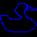
Another factor that plays into sprite design is
mirroring. The NES allows sprites to be mirrored either horizontally, vertically, or both. Mirroring both directions at once essentially allows a sprite to be rotated. The following image is an extremely simple example of mirroring in action:

Most graphics editors allow one to easily mirror and rotate sprites in order to get an idea of what a drawing will look like when finished, and let’s be honest, it is easier to mirror something than to draw something from scratch. However, at the programming level it is a great way to save space in memory! The NES can only hold 256 unique tiles of sprite data in memory at any given time (plus another 256 tiles of background data), so mirroring becomes essential at a certain point. Mirroring is one of main strengths that sprites have going for them, as background tiles cannot be mirrored! One more key limitation that shapes one’s drawing practices.

 http://goo.gl/xmzKR...