Anyone know the font that is used on the front of Super Mario Brothers and Duck Hunt games? (refering to single game version, and the title of the game under the pic) thanks
I think it's just the "standard videogame font" font which is used on pretty much every classic console at one point.
Search for a font called "Press Start", or "Press Start K" (heck, search for both. )
)
Search for a font called "Press Start", or "Press Start K" (heck, search for both.
If you just want to rip it for use in a graphics editor such as Photoshop, then open the ROM in question in a tile editor, press Alt+Print Screen to copy an image of the current window to the Clipboard, and paste it to the PC screen:

BTW, who had the copyright on that font? I'd bet the owner of that font could have made a wad of royalties.
BTW, who had the copyright on that font? I'd bet the owner of that font could have made a wad of royalties.
Motorola? I don't know...
I've seen variations of that font with slanted exclamation points, and different looking 8s. (see Tengen Tetris, or any pirate multicart with a menu to see the 8 )
I think it's just a PD font, or maybe whenever everyone makes a simple 8x8 char font, it ends up looking the same. Look at John's Quest (link's in my profile), and you'll see that my font (I drew it myself) kinda is similar somewhat to the classic font, with only a few differences.
Edit: Phantom Emoticon TM had to be eliminated.
Aren't all bitmap fonts still not "protected" by copyright, at least in the US?
Some typefaces can be patented in some way, but I can't remember the details.
Some typefaces can be patented in some way, but I can't remember the details.
its a 8x8 bitmap font, just how much variation can you get - prove that a font has been ripped instead of drawn, you can't
its no master piece of fonts, all 8x8 fonts have similarity with each other - well the sensible ones
its no master piece of fonts, all 8x8 fonts have similarity with each other - well the sensible ones
Not necessarily. I've been collecting 8x8 pixel fonts, and though the ones in Super Mario Bros., Tetris (Tengen), Tetris (Nintendo), and Lode Runner look rather similar, the one in the Mega Man series looks somewhat different, and the one used in Tetris for Game Boy is totally different.
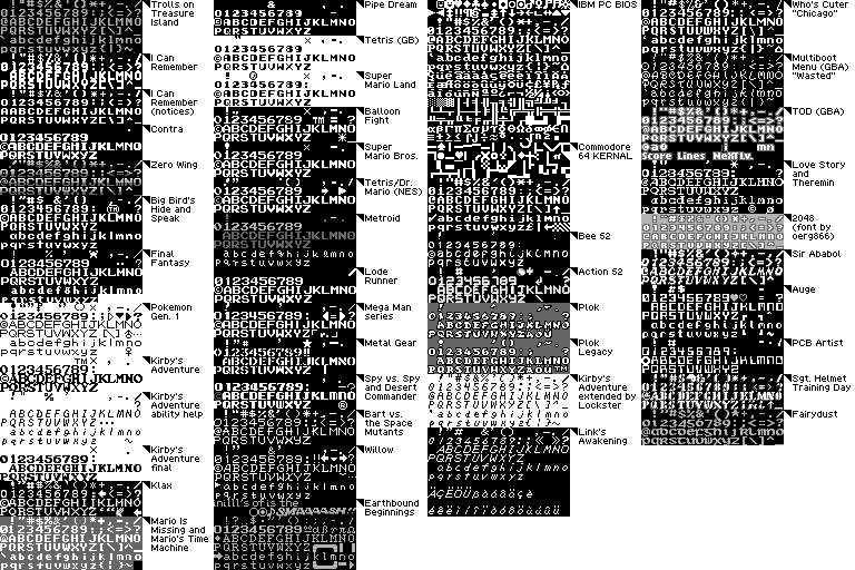
Figure 2: There's more than one way to make an 8x8 pixel font
See also http://www.empire-of-the-claw.com/Fonts ... e_zone.htm
Figure 2: There's more than one way to make an 8x8 pixel font
See also http://www.empire-of-the-claw.com/Fonts ... e_zone.htm
i'll re-phrase that, all sensible(non-obscure) nes fonts
using fixed width fonts, you're stuck to max or 7x7 (and systems like gba as some those fonts were has more advantage, because it can use the entire 8x8 pixel range because i know it can do variable width fonts in software easily)
but otherwise those fonts don't have sufficent variations, (excludinga couple of the gba fonts) they basically fall under a couple of styles
Hehe, I really like that font collection of yours, tepples. I like seeing what stuff game companies reuse. Nintendo almost always uses one specific PCM wave for its gameboy games, and I think I've seen that tetris gb font used in other gb games.
A lot of the games for the NES used similar fonts, except for the ones that didn't. (Wow, that's a weird statement. o_O)
Also, not a whole lot of games have a lowercase, but that's understandable. In JQ, I just use 100% standard Ascii order, and it fits exactly as a 2K bank (the other misc tiles like the window borders and arrows and nonstandard Ascii stuff are in another bank). And that is why JQ has a lowercase. Oh, and it's cool because I can just type text into the source directly, and it will print exactly as is. Hmm... when I make 8x8 fonts, I make the uppercase Y look funky. o_O It's like a big version of the lowercase y.
Hey tepples, did you collect those fonts just for this thread, or do you have some sort of hobby with collecting fonts from games?
A lot of the games for the NES used similar fonts, except for the ones that didn't.
Also, not a whole lot of games have a lowercase, but that's understandable. In JQ, I just use 100% standard Ascii order, and it fits exactly as a 2K bank (the other misc tiles like the window borders and arrows and nonstandard Ascii stuff are in another bank). And that is why JQ has a lowercase.
Hey tepples, did you collect those fonts just for this thread, or do you have some sort of hobby with collecting fonts from games?
Drag wrote:
Also, not a whole lot of games have a lowercase, but that's understandable. In JQ, I just use 100% standard Ascii order, and it fits exactly as a 2K bank
2 KB? That's half your tilespace gone right there.
Quote:
And that is why JQ has a lowercase. Oh, and it's cool because I can just type text into the source directly, and it will print exactly as is
If you order from @ to _ and then from space to ? (that is, $40-$5F then $20-$3F), and then you modify your text printing routine to do ORA #$c0, you can squeeze ASCII (without lowercase) into 1 KB without sacrificing source code readability. The Apple II and Apple II Plus character generator does something like this. The print routine in Mega Man 5, on the other hand, appears to use a lookup table to translate from ASCII in the ROM to CHR-space in real time.
Quote:
Hey tepples, did you collect those fonts just for this thread, or do you have some sort of hobby with collecting fonts from games?
Both.
Anyway, I drew the Who's Cuter font based on Chicago (the system font in Mac OS 1 through 7), and I based the mbmenu font on the font used on Precious Moments merchandise.
tepples wrote:
If you order from @ to _ and then from space to ? (that is, $40-$5F then $20-$3F), and then you modify your text printing routine to do ORA #$c0, you can squeeze ASCII (without lowercase) into 1 KB without sacrificing source code readability. The Apple II and Apple II Plus character generator does something like this. The print routine in Mega Man 5, on the other hand, appears to use a lookup table to translate from ASCII in the ROM to CHR-space in real time.
That's actually a good idea, I should do that, but not right now, because JQ really isn't tile dependent right now. I'll definately consider that if I need more tile space.
Drag wrote:
I make the uppercase Y look funky. o_O It's like a big version of the lowercase y.
eh?
Sorry I didnt put this on the firstr post lol, but I was refering to the font thats on the label of a smb or duck hunt =) Thanks
NOW you tell us! 
I find bold arial, or arial black tends to be very similar to the font, though not 100% exact.
I find bold arial, or arial black tends to be very similar to the font, though not 100% exact.
Yeah, any Helvetica-clone font should do if you're trying to do a trade-dress-based satire of the early NES library's cart labels.
How much reuse is there for Japanese fonts in NES games?