Brace yourselves! I'm probably going into too much detail, but here we go anyway!

M_Tee wrote:
May I ask why you felt that $24 and the $xC range needed hue adjustments, and how do they compare to prior to the replacements?
Well, this is what the palette looked like before I did
any tweaking to it
*:
Attachment:
File comment: Just what it says. It's still good, but… certain colors just don't look "juuuust right". (Particularly $24.)
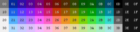 Kizul's_Definitive_NES_Palette_(UnTweaked).png [ 2.93 KiB | Viewed 9372 times ]
You can also download its respective emulator palette from here, in the event you wanted to try it out. (Would've attached it, but I can attach only three files, so… this and the screenshots below won out in the priority war.)Simply put: $24 looked out of place; it looked to me like it was too close in hue to the $x5 column, and it also looked too vibrant — both too bright, and too saturated. I use certain games for testing palettes, especially Solstice, which works great to show off why I changed $24:
Attachment:
File comment: Example screenshot from Solstice, using the Definitive UnTweaked palette.
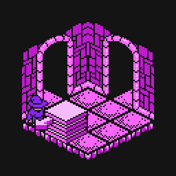 Solstice - The Quest for the Staff of Demnos (USA)_001.png [ 3.06 KiB | Viewed 9372 times ]
Attachment:
File comment: Example screenshot from Solstice, using the default Definitive palette (with the changed $24 color — among others).
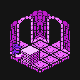 Solstice - The Quest for the Staff of Demnos (USA)_002.png [ 3.06 KiB | Viewed 9372 times ]
As you can see, in the top screenshot (with the UnTweaked palette), $24 appears to be too close to the 'warm' side of the spectrum, and thus looks out-of-place compared to $14 and $34.
The hue I tweaked $24 to (bottom screenshot) looks more like an intermediate shade between the 'light' and 'dark' purples used in that room.
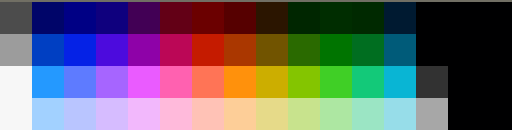
As far as $xC goes: I liked when it was slightly bluer like in the other palette that I posted much earlier in this thread. In the case of $24 and the $xC colors, I copied the un-tweaked color, changed its Hue to match the one I wanted, then tweaked its Value until it looked about the same (luminosity-wise) as the original, un-tweaked color.
Aside from the hue-replacement I did on the four colors mentioned above, I also did some minor tweaks to the tint on ten other colors: using NEStopia's Hue control, I tinted the palette to -0.6º to make it a little warmer; from that, I copied $06 and $16, $07 and $17, $08 and $18, and $x9 over the un-tweaked colors.
It made the reds and browns look more like what I see on my actual TV, made the dark yellows look ever-so-slightly less green (helping to separate them from the
actual greens), and… I just like the slightly-yellower/warmer $x9. Green's my favorite color — and I have a soft spot for that particular set of greens in particular.

Those are the only tweaks I did to make my 'Definitive' palette from this base, however.

M_Tee wrote:
I never thought someone would post a palette that I prefer to NEStopia's, but I really dig what you've done there, Kizul.
The main fault with NEStopia's palette, as far as I can tell, is the strong value jump between $x0 entries and $x1. The darks are just too dark. The other fault that nearly all NES palettes have is that they're just too saturated. If I were to adjust the settings on my TV to produce colors that saturated, then actual live-action television would be unwatchable.
Hurray!
I'm happy you like it.
In regard to the saturation levels: my tuner card uses a Bt8x8 tuner (I don't remember the exact one), and aside from using DScaler's Gamma Boost filter (and a few noise-reduction filters — also in DScaler — whose settings I cranked to maximum), I used as close to the default picture settings as possible.
If I recall correctly: in the Bt8x8 advanced settings, I turned on the 'Full Luma Range' setting, and also the Automatic Gain Crush (AGC) for both Odd and Even scanlines; if not for those being on… yeah, the colors would've looked hideously garrish and over-saturated. (And I also turned
off Odd/Even Luma Peak, to help reduce noise.)
M_Tee wrote:
As for the blue at 23, that was
an admitted mistake by FCEUX's developer and corrected with version 2.2.0.
FCEUX 2.2.0 Release wrote:
Fixed wrong default palette entry
FCEUX is up to
version 2.2.2 now, so it may be time to update your copy.
Ahhhh, I see. Hm. I have no idea what version I used to make my original screenshot, but I'll certainly update it!
Hopefully this post wasn't
too rambly; I mean —
I can make sense of it, but that doesn't necessarily mean much most of the time.

(I at least apologize for the novel that it turned out to be. XD)
*EDIT: What dougeff said here kept nagging at me:
dougeff wrote:
Quote:
I much prefer 0,0,0 for all blacks. I think is gives better contrast.
He's technically correct. (The best kind of correct.)
I was showing off my palette to my sister just a little while ago tonight, comparing it with a game that she was familiar with (Bucky O'Hare) in both an emulator and in the actual NES on our TV.
And I noticed something: the blacks on the TV were a lot darker than the blacks in the emulator.
So: I have retroactively revised the palette files in this and my previous post, and also the palette image in this and my previous post to reflect the
improved black levels.

Also, I'm curious, dougeff: is my palette with newly-revamped black levels better/more acceptable?
$0D is now pure black (0,0,0), and $xE/$xF are now 20,20,20 instead of 35,35,35 — which really
was much too bright — so as to keep 'compatability' with The Immortal. $1D, however, still
is 35,35,35, because any darker and it doesn't show up correctly in Bee 52. I checked the brightness level for $1D in Bee 52 against my TV, too, in the first dark level that uses a mostly-black screen. (You can easily warp to the level I used via going through either door and entering the farthest flower from the hive in Level 1.)


