Thanks everybody! Your comments motivates me push this thing forward.
Originally posted by: MrWunderful
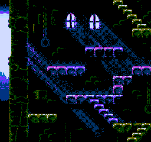
pink reflection tells me its dusk, but the color of the sky makes me feel like its a foggy cool morning.
I'll consider that. Thanks! The truth is i haven't yet decided if the sun will be setting (on a misty evening) or the moon will be rising om pale daylight or if it's just going to be morning fog. But i can hint at either of the former just beyond the treeline with a few sprites set to 'behind background' mode.
Originally posted by: Bert
I'd hang that on my wall
Thanks! Neat idea. Maybe i can find a suitable wall somewhere around the house. ^^ Would prints be a thing even if there was no clear game/product at this point?
Originally posted by: rlh
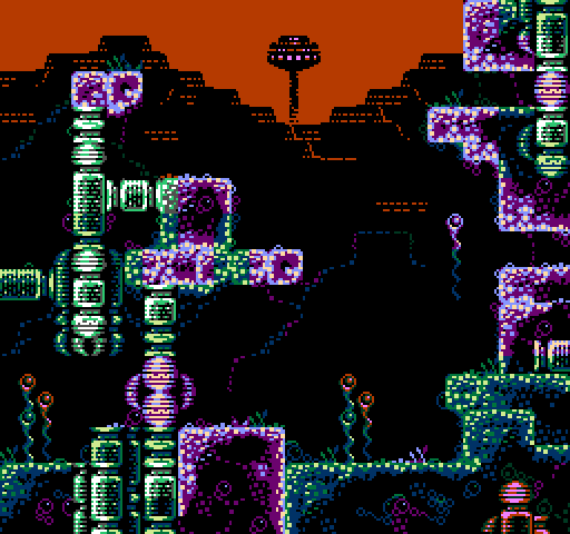
Ok, this is a VERY minor gripe and may not be warranted if this actually runs/displays on hardware but... something about the color pallet seems off in the sense that, to me, this feels like a vintage-y, pixelated image created in a modern tool, intended to look old. I think (and, again, I could be wrong) this could be because the hues of the colors don't perfectly match the limited pallets of older systems I've played games on. Since the pallet doesn't appear to perfectly match, say, an NES pallet, then it doesn't feel like an NES image. This could be an 8-bit pallet, which would work well for old dos games, but I didn't play many of those.
Rest assured, it does in fact adhere to NES palette restrictions and you can run it on the NES. It's just that the exact hues of the export tool is a little bit off the nominal NTSC colours*. I usually check against my PAL unit to see if things hold together. On my laptop, it looks a bit colder than it does on my TV.
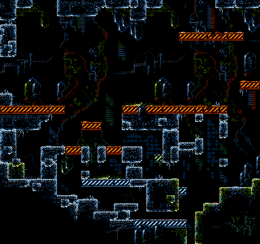
I get around most attribute clashes typical of the NES by keeping having several commong colours between the subpalettes, so it's not as colourful as a NES background could potentially be.
I think that (narrow selection of colours + a lot attribute grid avoidance) makes it atypical compared to a commercial NES game screen.
*but honestly any crt tv set will offset hues even more compared the next one, not to mention deviations between NTSC and PAL. That can pose a problem on some tv sets as the 'fog effect' of the far tree line relies on colours $1C and $13 not being all too far apart, but i'm willing to risk it.
=============
Quick update:
It started out as a freeform background piece that had no specific purpose (it could be part of a title screen animation, cinematic sequence, end credits, etc), but then it struck me that with a flat enough level it could actually work as level decoration for a shorter section, even though it occupies nearly all of the background CHR RAM. The flatness of the supposed level would make parallax scrolling a relative breeze.
Here's a start down that road.